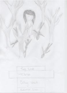
This is the first draft film poster plan I have design from the draft story boards I created. I decided to have a wide shot as it would be able to give away part of the trailer, or what the trailer was based on. Having the girl in the centre and trees surrounding here makes her see claustrophobic and alone, which is what a viewer may feel when watching the trailer. The whole idea of having the shadows from the trees being shadows of a man and all of the shadowing pointing towards here is emphasizing the fear and paranoia the girl is going through throughout the trailer. Even though this is an exaggeration of how paranoid someone would actually be in this situation it defiantly comes across to the viewer as a horror or thriller film poster, which is what I wanted. I didn't want the film poster to look like the usual horror thriller film poster with someone running away from one or hiding somewhere. As you can see this draft includes no colour, but i plan to include a massive contrasts between dark and warm colours; I think this colour scheme would show the contrast in the trailer where it starts off with the young girl walking her dog like an average normal day to her being chased and followed in the woods. Once i get my original draft images I will be able to create more of picture to what i am imaging the front cover to look like.
No comments:
Post a Comment