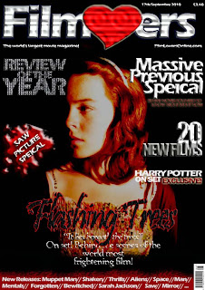
 This is the fourth draft for my film magazine front cover. As you can see again the only thing I have changed with the front cover is the main image. After manipulating the photograph of Kate in Adobe Photoshop I placed the image into the film magazine front cover and re-sized the image. After re-sizing the photograph and getting the right size so I could structure the magazine front cover conventions around it, I used the stamp tool in Photoshop to cover the blank spaces around the image on the front cover with the same colour black used in the background of the image. I think this main image works well with the poster as the red tint in the image contributes to the red, black, white and grey colour scheme. The image itself creates suspense for a viewer as half of Kate's face is in shadow which makes the viewer questions whats on the other side of the shadow.
To improve my film magazine front cover I could experiment with the other photographs I have manipulated and see which main image suits my front cover best. Also which image creates the best structure for the magazine front cover conventions.
No comments:
Post a Comment