 In this first image I manipulated you can see that I cut part of Kate out where the green background was showing through. Using the clone stamp tool I covered over the space with the same black colour in Kates shadow. Doing this I managed to cover all of the green screen behind Kate and just leave her in front of a black background. Using the contrast tool in Adobe Photoshop I change the lighting and shadowing in the photo so the viewers eyes would first be drawn to Kate's face.
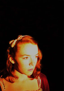 Using the same stamp tool in Adobe Photo shop I covered all of the green screen background using the same colour from Kate's shadow. After I had finished covering the green screen background I changed the light contrast and shadow of the whole image. Thia made Kate's face stand out a lot more as where the light was on her face is a lot brighter. This makes a viewer attention concentrates mostly on Kate's face and her expression. I then used the colour contrast tool in Adobe Photoshop and made the red in the image more prominent. This would match the red black and white colour scheme which I going to be using through my film magazine front covers and film posters.
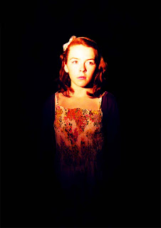 Again, in Adobe Photoshop I used the stamp tool to cover the green screen behind Kate. After I had cover all of the green screen and blended it around Kate so she doesn't look out of place I changed the light and shadow contrast. Doing this made the light on Kate's face brighter and made her face stand out more. This has the same effect on a viewer as the previous images I have manipulated. I then used the colour contrasts tool and darken down the blue tone in the image. This made Kate's cardigan and the bottom of her dress blend into the dark background. This effect contributes to the viewers attentions being on Kate's face.
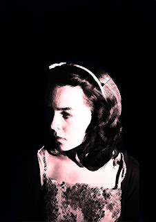 As you can see I have manipulated this image a bit further that the previous images I have shown. I repeated the same process of covering the green screen in the background with the stamp tool in Photoshop. I also changed the contrast of the lighting and shadowing in the image to make Kate's face stand out and also create a really dark shadow on the left side of her face. This interests the viewer as there automatic reaction to this image would be to know whats on the other side of her face.
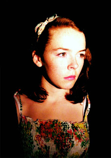 Following the same process I went through to cover the green screen in the background for the previous images I managed to cover the whole of the background in this photography of Kate. Again using the light and shadow contrast in Adobe Photoshop I made Kate's face stand out from the rest of the image. This emphasizes her facial expression. I didn't tone any of the colours in the image down as the image is already toned into the black background.
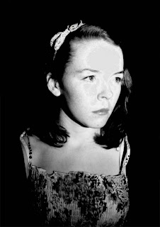 As I didn't change any of the colour contrasts in the previous photograph, and this is why I changed the whole image into a black and white image using the black and white contrast tool in Adobe Photoshop. So I think this makes the image more appropriate for a horror film magazine front cover or a horror thriller film poster.
No comments:
Post a Comment