Tuesday 28 September 2010

Film Magazine Front Cover First Draft


This is my first draft film magazine front cover. I used one of the images I previously took and manipulated of Kate. I then placed this image into Adobe Photoshop so I could then add the conventions to the front cover. To create the masthead for the magazine front cover I typed in 'Film ers' into Photoshop, leaving a gap knowing that I would be adding a heart shape from the Internet in the center so the masthead would say 'Film lovers'. Using the layer style tool in Photoshop I added a inner shadow, outer glow and a texture effect to the text and the love heart. Looking at various magazine front covers on the Internet and previous covers I have analysed on my blog I added a date and price for the magazine in the top right hand side of the magazine front cover. Also added a small quote beneath the masthead saying 'The worlds largest movie magazine!'. Having this quote entices viewers to purchase the magazine. Analysing the previous magazine front covers I also added a plug on the right hand side of the front cover. This plug promotes one of the pages in the magazine which is makes the cover seem more realistic. Also in Adobe Photoshop I added a plug at the bottom of the front cover. This plug includes new film releases which are included in the magazine. Using the brush tool I blended the red box into the black background, which adds to the horror and thriller theme to the magazine front cover. Taking a barcode image from the Internet and placing it in the bottom right hand corner of the magazine front cover, this contributes to making the film magazine front cover seem more realistic.
For my next film magazine front cover I could improve it by including more plugs and text which makes the cover more interesting and compact.

Friday 24 September 2010

First Draft Film Poster

After manipulating the images that I took of Kate they gave me idea of how I could structure a film poster. I use the image of Kate kneeling down with her hands over her ears. I prefer this image compared to the rest of the images that I took because the effect I have used in Adobe Photoshop has made her face look slightly distorted. This confuses the viewer which immediately makes them interested in the poster as it questions them about what it's about. The colour scheme I set was black ,grey and reds. All these colours are gloomy dark colours which contrast with the white background of the image. The Film Title that I chose was 'Flashing Trees', this title is just a template until we all decide on a finial film poster after we've discussed our individual final film posters. I choose 'Flashing Trees' as the film title as it represented the woods in the film trailer and the flashing of the camera from the person or thing following her taking photographs. Using the liquefy manipulation in Adobe Photoshop i edited the text to make it look like it was either dripping with blood or lots of sharp spikes coming out of the text. From this effect you can defiantly tell that this film poster is for a horror thriller film trailer. The font that I have used for the Film Title, Tag Line, Billing Block and the Release Date are all the same as this makes the poster more organised and familiarises the viewer; having different text for each bit of text would over load the poster and it would look like too much was going on. Overall I am happy with my first draft film poster and taking more images and continuing to manipulate them I am sure I can improve on a final film poster and my Adobe Photoshop skills.

Manipulated Images

Using Adobe Photoshop I manipulated these photographs i took of Kate in the woods. I manipulated the images


Monday 20 September 2010

Film Poster Draft Two

As we have taken more photography's of Kate who's our actress in the teaser trailer, they gave me another idea to how I could structure a film posters. I decided to use the the image of Kate kneeling down with her hands over her ears looking frightened. Placing this close up image of Kate in the centre of the poster will draw the viewers attention to her facial expression. The background of the poster would be a dark colour which would also help the Tag Line, Billing Block, Film Title, release Date and the main image stand out. The Tag Line is structured above the main image at the top of the poster which draws the viewers eyes to it and questions them what the Tag Line has to do with the film. Having the Film Title, Billing Block and Release Date close together at the bottom of the poster makes the structure of the poster seems oragnised, if the text was all over the place then it would confuse the viewer. Also having more space on the poster for the main image helps the viewer focus on the image instead of the text.

Film Magazine Front Cover Draft Two

After taking images of Kate in the woods it gave me a better idea of how i could structure a film magazine front cover. Therefore I designed another front cover. Having a close up would make the whole image seem more intense as you can see clearly the scared and worried expression on her face. I structured the masthead at the top of the front cover for the same reason why every other magazine's masthead is placed at the top. So when the magazine is piled up in the store you can see the masthead above the other magazines. The rest of the images and text is placed around the main image which draws the viewers attention to the image. Placing the film title and the text to go with the film below the image would make it clear to the viewer that the main image is about this film.

Friday 10 September 2010

Further Transcript

As a group we deicded not to include any talking in our trailer as not including any sound would create more mysterious and make the viewer question whats going to happen. Also in the meeting the decided to have bird noises and car noises in the first two shots which would set the scene. It would seem like a normal day and the viewer wouldn't expect anything. When the trailer cuts to the blank screens with the tag line and the quote from a film magazine we decided to use a clicking noise of a camera. This noise would foreshadow the ending to the trailer where the girl discovers a shrine full of photographs of herself. In the story board there is one shot of a Kate closing, in this shot you would be able to hear a large bang noise of the gate shutting. This would create excitement for a viewer as they would expect something to happen. When all of the short cuts start to happen we had decided to use a heart beat noise for each cut as this would create excitement and tension for a viewer. The heart beat symbolises the panic that the young girl is feeling while someone or something is following her. In the story board there is one shot which is a point of a view shot where someone or something is following the girl. In this shot we decided to include heavy breathing coming from the person holding the camcorder. This would create suspense and frustration for the viewer as they would be wondering who this person is.

Further Story Board


Shot One

This is an establishing shot which will open the trailer. This shot will pan down the street which will end with a shot at the end of the road where Kate's house is in view. Over the shot you would be able to hear birds and anything you would usually hear while walking down the street. This shot will set the scene for the first start of teaser trailer


Shot Two

This is an extreme close up shot of a key being turned in a lock. We decided to use this shot as it would show a viewer clearly that Kate is leaving the house. It also gives the teaser trailer a variety of different shots


Shot Three


This shot is of a blank black backgrounds with the producers logo. We are including this shot nearly the beginning of the teaser trailer as most trailers include their producers logo here. They do this to encourage any viewer who enjoyed a previous film produced by this company to go and see this film.

Shot Four


This shot is of a girl walking through a gate in the wooded area. The gate symbolises the trapped feeling the girl will later on feel when she is being chased by someone or something and discovers the shrine full of photographs of herself.

Shot Five

This shot is a close of the gate closing which the girl has just walked through. This emphasizes the trapped feeling the girl will be feeling later on in the teaser trailer. On this shot you would also be able to hear the loud noise of the gate closing.


Shot Six

This is an extreme high angle shot of the girl walking through the woods. This shows the lack of power the girl has like someone is looking down on her. This warns a viewer that something is going to happen to her.

Shot Seven

This is a wide long shot of the girl walking away from the camera through the wooded area. This resembles the lost trapped feeling that the girl will be feeling later on in the trailer as she will have no one to help her.


Shot Eight


This is a point of view shot of someone watching the girl walk through the wooded area. Over this shot a viewer would also be able to hear heavy breathing which would be coming from the person or thing watching her. This creates tension and frustration as the viewer really wants to know who or what this thing is watching her.


Shot Nine

The next shot is of a blank screen with a quote from a film magazine like Empire. This would encourage any viewer who enjoys reading the Empire to go and see this film.


Shot Ten


This is an extreme close up shot of the girls face while she's looking around. We are using this shot to show the viewer the panic scared expression on the girls face. This makes the viewer questions them selves what is she looking for. This is the shot where the heart beat starts and continues to sound bridge over the rest of the trailer. As the rest of the shots in the story board are short cuts they will all cut in time with the heart beat.


Shot Eleven


This shot is of a blank screen with the tag lines from the trailer. As all of the trailer we individual analysed we noticed that all of them included the tag line in their trailers. This make sour trailer seem more realistic.

Shot Twelve


This shot is an extreme long shot of the girl running through the woods. While the girl is running she constantly is looking behind her. This makes the viewer wonder what she is running from. again, this shot is a short cut again in the same rhythm as the heart beat.

Shot Thirteen

This is a close up shot of a bloody hand print on a tree trunk. This shot makes the viewer wonder who's blood this is, the young girl running, or the thing following her. This would encourage them to go and see the film.

Shot Fourteen

This is a shot of a large manly shadow in between the trees in the woods. In this shot a viewer would not be able to see any detail in the shadow, this would frustrate them as they want to know who this shadow is.

Shot Fifteen


This is an over the shoulder shot of the girl looking around. We decided to include this shot as it would make the viewer feel like they are more involved in the trailer as they are seeing things from the girls point of view. The heart beat sound and rhythm will also be continuing through this shot.

Shot Sixteen


This is a quick pan shot of the wooded area. The whole point in including this shot is giving the viewer a chance to see if they can see anything in the background as they would be expecting that. It confuses the viewer and slightly frustrates them as they still don't know what this thing is following the girl.

Shot Seventeen

This is another close up shot of the girls face, but this time the girls facial expression is more worried and panicked as she knows something is following her. She would also be moving her head round frantically as she cant see where this thing or person is.

Shot Eighteen

This is a close up shot of the girls feet running. In this shot the camera would follow the girls feet as she runs frantically. This shot would make it hard for a viewer to see anything in the girls surrounds and they would wonder again what she is running from.

Shot Nineteen

This is a wide long shot of the girl standing in the woods with the a manly shadowing hiding in the woods behind her. In this shot the viewers can see the shadow but the young girl can not. This would slightly frustrate the viewer as they wouldn't be able to see any detail of the shadow and still wonder what it is.

Shot Twenty

This is a close up shot of the young girl again. This time she is more panicky and looking around with a more worried look on her face. We used another close up shot of the girls face as I think they are

Shot Twenty-One
This is the final action shot in our story board. This shot is a wide shot of the young girl discovering the shrine full of photographs of herself. This shot will end when the girl turns around and stares into the camera.

Shot Twenty-Two

This is the ending shot in our story board. From when we all analysed horror and thriller promotional packages individually we noticed that all the trailer included the film title and the release date at the end. This is why this black background with the film title and release date is our final shot in our teaser trailer.


Meeting Three - Story Board and Images

As i have stated in our previous meeting, we all decided to have a look at each others story board and compaire ideas. In doing so we will come up with a final story board together which will be used when we film our teaser trailer. Even though we have all came up with different story board and when we do come up with a final one we will still need to make some changes and improvments as it depends on what works and what looks better when we start using the equipment. the story board could even turn out to be too short or long for a teaser trailer.
We then discussed each others story boards, and took it in turns explains our own story board while we took notes on each others.

- Laura's story board.
Started off with an establishing shot of the young girls house, and the girl leaving the house with a dog. It them flashes to the next shot with a camera clicking noise. this shot is of a blank black screen, as she was unsure what text to include here. Next shot would then cut to the girl walking her dog through the woods. the point in this shot was to show the viewer where the girl was going instead of just cutting to a shot of her in the woods which might confuse the viewer. again the flash camera clicking effect is used to cut to another blank screen, this time this blank screen would have the actors and actress's names in a red blood font. The next shot would cut as normal to a wide close up shot of the girl in the woods and then the camera would pan around to a shot with a dark figure in the trees; but you can only see the shape of this figure not any detail or features. Once again the flash camera clicking effect in the cut to the next shot. This shot is of a black screen again with the realise date written in red blooded text. Using a straight cut again the final shot is an extreme wide shot of the young girl running away from something in the woods.

-Hannah's story board.
This teaser trailers story board starts off with a long shot of a young girl walking her dog through the woods. Using the same effect which all of us have used in our story boards as we discussed this in our first meeting; the next shot cuts by using the flash camera clicking effect to a black screen. On this black screen is the film title. Using a straight cut the next shot which is a wide shot of the young girl screaming at a black figure in the woods, the black figure is in the shadows of the trees so you are unable to see any features or details of the figure. The same flash camera clicking effect is used again but this time cuts to a blank screen with the actors and actress's names on. At this same point creepy music will start playing. The next shot cuts to a blank screen with the title of the film.

-Sally's story board.
Sally's story board for our teaser trailer starts off with an establishing shot of the young girl leaving her house and shutting the door. then goes to a close up of the girl putting her key into the door and locking it. The trailer then cuts to a black screen with the Directors name in white text. Also when this shot cut to the black screen with the text, the sound of the girls humming starts. An Establishing shot of a street is then used with the humming sound being bridged. A low angle point of view shot is then used of the key, this shot then tilts down to a point of view shot of the trees in the woods. Then a striaght cut to a wide shot of a dark figure watching the young girl walking through the woods. Before the next cut the sound bridge of someone humming then stops. The same flashing, camera clicking effect is used and the trailer cuts to a black screen with the Tag Line. Short cuts are then used for the next two shots. A flash in the next cut then used to a close up shot of a blooded hand. Then cuts to a close up of a shadowed face and heavy breathing starts. The same flash camera clicking effect is used and the trailer cuts to another black screen and the sound of a girl screaming then plays. The next shot is then of the young girl running through the woods. A close up of the girls paniced face looking around the woods is then used. A wide shot is then used of the girl standing their with photographs of her all hanging around her. A heart beat sound is then used. A straight cut to the final shot in the story board which is a black screen with the title of the film and the release date. echoing of screaming is then used.

After we each went through our own story boarding explaining each shot we went through shots we thought should be included in the final story board. We wrote down on a sheet of paper what each shot would be and what would be included in it. After we had written it out we decided to draw out this story board and see what it would look like and if there was any shots missing.

Draft Images

To help us as a group decide which images were best to put onto a film poster and a film magazine front cover we brought our actor Kate McCormack and went into some local woods and look different types of photographs. We took it in turns using the camera and taking pictures so we each got different types of images to work with. None of these images have been manipulated using Adobe Photoshop; after the group as a whole have pictured image that we think will work best we will manipulate them. I think a really good way we could improved these images would be by concentrating on the costume and props; using torn clothing and fake blood.

First Image
This first image I think would make a good film poster as it has the dark and warm colours scheme so their is a contrasts. Having this contrasts is defiantly a good idea as it represents the dramatic change that happens in the teaser trailer. Even though the blurred effects looks interesting and makes the viewer confused, I don't think having this image as a film poster would represents the trailer the way how I would like it to.

Second Image

In the second image taken you can see the same dark and warm colour contrasts has been used. In this image Kate is kneeing down with her hands over her ears and her eyes closed. I think this image shows innocents and fear; but i think the image might be too simplistic to be a film poster and especially for a film magazine front cover as their isn't much detail.

Third Image

Again in the third image the contrasts of colours is still being used, which is exactly what i was looking for. from looking at film posters and trailers from previous films i have learnt that it is a good thing to give away small details about the film in the film posters as it leaves the viewer questioning the story line. also having Kate's face lite up and the rest of the image being pitch black makes the viewer see what kate sees and the claustrophobic she feels.


Fourth Image

This image is very similar to the second image i took. It's the exact same position that Kate is sitting in, but from a different angle. I think this image is a lot clearly than the previous one as in this image you can see clearly what Kate is doing. It defiantly shows she is scared and lonely.

Fifth Image

This last image is a lot different from the previous images i have took. This image has less of a dark and light contrasts as you can see their is more colour. also another big different between this image and the rest of them is that the other images all have Kate's face in them, whereas this one you can only see her back. I really like this image as it shows the film in a way that i would like it to be show, just depends on what way the viewer sees it. It reminds me of one of the shots i have included in my story board where you can see the back of the girl like someone else is watching here.

Initial Transcript

As the teaser trailer we are producing is with in the genre horror and thriller, and as horror and thriller trailers are based on building suspense and an erry atmosphere for the viewer including a lot of dialect would ruin this atmosphere.
At the start of the teaser trailer where the girl leave her house to go and walk her dog she could shout up to here mum or who ever is in the house at the time "See you later, I'm just walking the dog.". Even though having a lot of dialect could ruin the atmosphere we're looking for not having any at all could put a viewer off the trailer as it could confuse them. This is why i thought it would be a good idea to include some dialect while the trailer wasn't at the building up the tension and suspense stage.
I also thought about while the girl is walking her dog as soon as she leaves her house she could be humming a tune, which would start to make the viewer question what is the teaser trailer building up for. It also lightens up the mood a bit more so when the contrasts changes from being a happy normal film to the suspense building creepy side of the trailer. I think having a big change in a trailer like this has a bigger impact on the viewer.
While the short cuts are happening of different parts of the film having the girl screaming and shout out things like "Who are you?" "Leave me alone!" and "What's your problem?" would questions the viewer about what is actually going on.

Meeting Two - Catch Up

As we haven't seen each for the past five weeks as we were all on our summer holidays we decided it would be a good idea to catch up and share our ideas. In this meeting we discussed the first story board drafts, first magazine front cover drafts and first film poster draft we all created over the holiday. We also stated our roles again to make sure everyone knew exactly what they were doing so they could plan ahead. My role in this project is Producers Assistant and Editor, Hannah's role is Camera, Laura's role is Director/Producer, and Sally's roles are Sound and Continuity.
While we were all discussing our first draft story boards we had all came up with similar ideas which was expected from what we discussed in our first meeting. We all included the girl leaving her house and walking her dog through the woods and their being short cuts to create suspense.
As we had already decided to have a second meeting in the next few days to decided on a final story board and the final transcript we decided to just keep this meeting a short meeting so we just understood where each other were and whether we were all at the same level or not.
Also in this meeting we discussed who would be best to be the girl actress in the teaser trailer. As a group we came to the conclusion that Sally's younger sister Kate McCormack would be best to use as the young girl. we decided this as she looks around about the same age as we were planning on the actress to look like, she goes to the same school as we do so it's easy for us to get hold of her, and also she lives in the same house as Sally, and all of us live relatively near each other which make sit even easier for us to record and take photographs of her.

Film Poster Draft


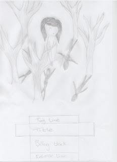
This is the first draft film poster plan I have design from the draft story boards I created. I decided to have a wide shot as it would be able to give away part of the trailer, or what the trailer was based on. Having the girl in the centre and trees surrounding here makes her see claustrophobic and alone, which is what a viewer may feel when watching the trailer. The whole idea of having the shadows from the trees being shadows of a man and all of the shadowing pointing towards here is emphasizing the fear and paranoia the girl is going through throughout the trailer. Even though this is an exaggeration of how paranoid someone would actually be in this situation it defiantly comes across to the viewer as a horror or thriller film poster, which is what I wanted. I didn't want the film poster to look like the usual horror thriller film poster with someone running away from one or hiding somewhere. As you can see this draft includes no colour, but i plan to include a massive contrasts between dark and warm colours; I think this colour scheme would show the contrast in the trailer where it starts off with the young girl walking her dog like an average normal day to her being chased and followed in the woods. Once i get my original draft images I will be able to create more of picture to what i am imaging the front cover to look like.

Film Magazine Front Cover Draft


This is my first draft of a magazine front cover. I think trying to recreate the horror thriller atmosphere that would be in the trailer and the film poster is a lot harder to create in a magazine front cover. It's hard to pick an image that represents the trailer in the right way as well as it not seeming to unrealistic.
An image that first came to mind when I thought about this film trailer as a magazine front cover is the young girl being alone with her dog. This is why I decided the main image to be the young girl having a scared expression on her face while she was holding her dog. The only problem with this is that the dog that we would be using in the trailer is quite an old dog so the actor we would be using wouldn't be able to pick the dog up like this.
I choose the Masthead of the magazine to be at the top as this is the convention for most magazine front cover. Having text and images surrounding the main image makes the girl seems claustrophobic and lonely. Structuring the text like this create the sort of atmosphere.

Wednesday 8 September 2010

First Story Board Draft

To help each group member to think about each shot taken in the teaser trailer we each decided to design our own ideal story board for the teaser trailer we each had in our heads. As this is only a draft the idea's are very simple and as we haven't used any of the editing software yet were not sure exactly what effects we can include in the trailer. During the previous meeting we discussed which shots we wanted to included in this story board and wrote all these ideas down. I then drew out the story board from the notes I had made and the group suggesting ideas.


Shot One

The first shot would be an establishing shot showing where the girl lives. I didn't want to show the viewer straight away the girl in woods, which is where most of the horror and thrill part of the trailer is. Not showing the viewer straight away creates suspense because they already know the film is a horror thriller from the film poster and magazine front cover. straight cuts are used through this story board to show the realism of the story line.


Shot Two

The second shot is a wide shot of a girl walking out of her front door with her dog. This is the only shot where dialect is included. I think this shot is a really good way to set the relaxed settled atmosphere so the change later on in the trailer would be a lot more dramatic. The only sound you hear in this shot would be the girl talking to her mum, the dog, the wind and the birds and the door slamming.

Shot Three
This is an establishing/wide shot of the girl walking through the woods with her dog. An establishing/wide shot is used to show the viewer that this is a different scene in the film. You would be able to hear the wind and the trees, and the girl humming a tune which adds to the relaxed atmosphere.


Shot Four
This shot is cut from the previous shot with a straight cut but this time their is a sound effect and a flash added like a camera taking a picture. in this shot it would be a blank screen with the producers logo on it. This makes the teaser trailer seems realistic as in real trailer they include the producers logo to encourage viewers to go and see the film if they are a fan of the producers.
Shot Five

This shot is a mid shot of the young girl walking her dog through the woods. This shot would be constructed a lot different from the rest of the shots used in the teaser trailer, as it would be hand held and a point of view shot. The effect I am looking for from this shot is to show the viewer that someone or something to watching the girl, i would make this obvious by taking the camera off the tripod and rustling in the bushes. this would question the viewer and make them wonder who is watching the young girl.


Shot Six
This shot is a high angle shot of the young girl walking her dog through the woods. The reason why I choose to use a high angle shot is to represent the sense of power and that the young girl is being looked down on. It foreshadows that something bad is about to happen to her and her dog.


Shot Seven
Here is another mid shot of the girl walking with her dog through the woods and it starts to get darker. This builds up tension for the viewer as they are still puzzled about who was watching her and why.


Shot Eight
Cutting to this shot It will have the exact same effect as the cut to shot four. The idea of having a camera effect is to show the viewer that someone is watching and following this girl talking photographs oh her. This leaves the viewers in suspense as they wonder who this person is who is following her, and what it will lead to. In this shot it would be a blank screen with the Tag line for the teaser trailer in white or blood red text. This makes the teaser trailer seem realistic as in real trailer the producers include the Tag Line in the trailer.


Shot Nine
The next shot then just cuts to a close up of the girls face. this close up shot is used to show her expression and that she is worried about something. This questions the viewers and makes them wonder what she is worried about, whether she has noticed the person or thing following her. The main aim in this shot is to build up the suspense for the dramatic change in the teaser trailer story line.


Shot Ten
The same camera clicking flash effect that i used previously in shot eight and shot four are being used again here. continuing this effect on shows repetition which could show the viewer that this thing or person following the girl could of done this to more than one person. In this shot it would be a blank screen and a quote from the film or either a film magazine. This would entice a viewer to go and see the film as the quote from the film magazine would make them think the film must be really good, especially if its a film magazine they have been reading for a long period of time. Adding this shot in makes the teaser trailer more realistic.


Shot Eleven
The next five shots are all straight short cuts, and while they cut a sound effected is going to be used like a heart beat or a dun dun noise. This excites the viewer and creates confusion as the shots are going so quickly and changing to completely different scenes throughout the film it questions the viewer what is going on. This shot is a wide shot of the young girl is running through the woods by herself without the dog. this makes the viewer wonder what the girl is running from and what has happened to her dog.


Shot Twelve
Using a straight short cut again, this mid shot is of a bloody hand print on a tree. This makes the viewer wonder where the bloody hand print has come from and for those who enjoy horror thriller films this part of the trailer would entice them to go and see the film.


Shot Thirteen
This is a behind the shoulder shot of the young girl running with patches of blood in her hair. In this shot you would be able to hear the panic in the girl heavy breathing and the sound of her brushing against the trees and bushes while she is running. This helps the viewer get a better idea of how scared the girl is, which creates suspense.

Shot Fourteen
This close up shot of someone holding a stick with blood all over it and their arm is also another shot that would entice a horror thriller fan to go and see the film. It creates excitement and suspense as the viewer doesn't know who's arm it is, who's blood and why they need the stick in the first place. It lets the viewers imagination guess what might be happening instead of the teaser trailer telling this.


Shot Fifteen
In this wide high angle shot you can see the girl lying on the floor our of breathe. The high angle shot shows the lack of power this girl has, and questions the viewer whether she has given up on this person or thing that was following her. Having this as the last actions shot that the viewer sees entices them to go and see the film because they want to know what happens.


Shot Sixteen

Using the same camera flash effect used in previously shots to cut to the final shot reminds the viewer of the start of the teaser trailer where the girl was beginning to be followed. this makes them think more about the film and again makes their mind try and figure out what happens. In this final shot it would turn to a black screen with the film titles. the release date. The release date would be in either a blood red colour or white to help it stand out from the black background.