To help me with the editing process of the teaser trailer I decided to have a look at some more trailer but focus on the editing side of the trailer. This should help me realise what sort of editing I can include and expand my initial ideas.
I chose to analise the Happy Potter And The Deathly Hallows Trailer as I think this trailer has a really interest editing technique which I think would work really well with our teaser trailer. In this trailer after 52 second it follows a certain pattern. The trailer constantly uses short cuts which are about a heart beat long. Each shot contain a short shots from the film itself. In doing so this helps build up tension and suspense for a viewer. Adding to the suspense the trailer has also included a drumming noise each time a short shot cuts. This gives the viewer the feel of someones heart beating fast, maybe a character in the film and there adrenaline pumping which makes a viewer feel like their involved in the trailer. I think using this effect would defiantly suit our teaser trailer as it would get the viewers adrenaline pumping, making then feel more involved in the trailer which would encourage them to go and see it as a film. Also getting a viewers suspense and tension build plays a huge role in horror and thriller films.
This is the trailer for One Missed Called, which is more of a horror thriller film than the previous Harry Potter trailer I analysed. Around half way through the trailer at 1 minute 45 seconds all the shots become short cuts and a drumming noise similar to a slamming door is used between each cut. All of the short shots contain footage from the film, where as two of the shots include a blank blue screen containing the tag line. Splitting the tag line into two is also a good way to create suspense as the viewer for them few seconds wonders what the rest of the tag line is. This trailer has used a similar editing technique to create tensions for a viewer and make them feel like they are involved in the trailer them selves.
This is a trailer from the film When A Stranger Calls. The end part of the film does include a similar editing technique which the previous two trailers have included to build in a viewers suspense, but at the start of the trailer they do something which I think is very different. At the beginning of the trailer we see a telephone which gives away that the film is about someone calling her. But after a second or two of seeing the zoom shot on the telephone the trailers cuts to a black and white short cut of a girls face. It then quickly cuts back to the zoom shot of the telephone and back to a different black and white shot of the girl. Along side these cuts you can hear a distorted scream. This is very different to how most horror thriller trailer begin and catches the viewer off guide which gets their adrenaline pumping. I think it would be a really good idea to include it in our teaser trailer as it would be a great way to build up tension and suspense from the very beginning.
Tuesday 19 October 2010
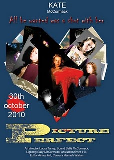
Group Final Film Poster
 This is the groups final film poster. It is a combination of all the groups ideas for their individual film posters and what we thought would work best as a film poster. I think we all made the right decisions as I am very pleased with the final outcome. Sally and Laura paired off and with the ideas we discussed during our meeting they created the final film poster in Adobe Photoshop.
As you can see the main image ideas that has been used in the poster is the same ideas that Sally used in her individual film poster final. I really like how the photographs of Kate have been placed in a love heart shape, as it is very unique and different to how previous horror thriller films have designed their posters. In our meeting we discussed that having a black background for the poster would work best, as it contrasts with the film title, release date, tag line, billing block and actresses name. This makes it easier for a viewer to read the text. Also keeping to a black, white and red colour scheme adds to the continuity of the poster and the horror thriller genre. As we discussed in the meeting I think the film title we chose to include in the final group film poster was a very good choice. Using Laura's 'click' film title pulls the whole poster together. It's short so it doesn't take over the poster and it is relevant to our teaser trailer. The way how Sally and Laura have written 'Kate McCormack' I think works very well with the poster and makes it seem more realistic. I think placing the tag line which was from my individual film poster above the main image is ironic because beneath the tag line is the main image which contains lots of photographs of Kate. This questions the viewer and leaves them wonder what the tag line means and how it is relevant to the film. Overall I think we did a good job on deciding what we should include in the final group film poster and putting it all together, I am really happy with the final outcome.
Friday 15 October 2010
Group Final Film Magazine Front Cover
 This is our groups final film magazine front cover. It is a combination of all the groups ideas and what we thought would work best for our front cover. I think we made the right decision as the front cover looks very appealing and defiantly represents our teaser trailer very well. Continuing with the black, white and red contributed to the horror thriller genre which relates to our teaser trailer very well. The main image itself creates great structure for the front cover and the red tint in the image fits in with the colour scheme. Each plug on the cover is completely unique to the others which makes the cover more appealing to a viewer and stand out. Also I think including Laura's film title really works well with the rest of the front cover and the liquefy effect creates a great effort. Using the bottom plug that's placed across the bottom of the front cover makes the magazine front cover seem more realistic and appealing to the viewer. Using the red box with the fading effect which I did using the paint brush in Adobe Photoshop also contributes to the horror thriller genre and the colour scheme. Having the barcode, price and date all in the same section also makes the film magazine front cover seem more realistic when we weer analysing previous film magazine front covers most of them kept them together. As a group we are all really happy and impressed with the final outcome.
Meeting - Finalising Film Posters and Film Magazine Front Covers
After we had all individually designs a final film poster and final film magazine front cover we decided we needed to have a meeting and share all our ideas to come up with a group final for each.

My individual film poster
Sally's individual film poster

Hannah's individual film poster
We first looked at each film poster individually and pointed out what we think would work and what we didn't think would work well with a horror thriller genre film poster. We first started with looking at all the film titles. We came to a conclusion that 'Click' would work bests for our film title, as it wasn't too long and it was rel event to the teaser trailer as a camera clicks when you take photographs. Comparing to the rest of the mastheads we had to choose from, 'Flashing Trees', 'One Day' and 'Perfect Picture', the film title we choose was more relevant to the trailer and also foreshadowed what happens, which creates suspense for a viewer.
Secondly we shared our tag line ideas to decide which one worked best with a horror thriller film poster and our story line. As a group we decided that 'It lies beneath the trees' would work best with the film poster as it create thrill and suspense for the viewer. It questions that and leaves them wondering what happens in this film. The other tag lines that we had to choose from were 'Be prepared to be scared...', 'Was he only being friendly?' and 'All he wanted was a shot with her'. The reason why we chose the tag line from the film poster I designed was because we all felt as a group it was more relevant to the teaser trailer itself and the genre horror and thriller.
When it came to deciding which main image worked best for our film poster we struggled a little bit as there was two main ones that stood out to us as a group. We all really liked Sally's main image and Laura's main image on their posters because they bothy worked really well with the plot for the trailer. In the end we decided as a group to go with Sally's main image as it was a very unusual compared to previous horror thriller film poster we all analysed. Having this difference would hopefully appeal to the viewer and entice them to go see the film thinking its a lot different to previous horror thriller films. We also decided to include Laura's main image in the heart collage that Sally had create as we all thought that Laura's image would have a great effect on a viewer.
Also for the final film poster we decided as a group to only include the actress's name 'Kate McCormack' and place it in the center at the top instead of at the side in the corner. This would make it easier for the viewer to notice and read the actress's name.
As a group we all decided that there would be a black background because almost everyone film poster used a black background and it also would contribute to the horror thriller genre. Also went with the release date that the film poster I designed used ' 31st October 2011', as it would ironic for the film to be released on Halloween.
Deciding what should be included in the billing block was a long discussion as we were all unsure what we would include in the final film poster. However Sally found a template of a billing block
and we decided to follow this template including a made up producers names, our names and Kate McCormack's names for the lead actress.
We also noticed on Laura's film magazine front cover that she had included 'The scariest film of all time - Empire'. as a group we decided this would be really effective to use on the film poster. If this was a film poster for a real film having a quote from a well known film magazine would defiantly be a key feature to encouraging viewers to see the film.

One of my film magazine front cover drafts which we looked at instead

Sally's individual film magazine front cover

Laura's individual film magazine front cover

Hannah's individual film magazine front cover
After deciding which film poster ideas works best for our final poster we moved on to discussing each individual film magazine front cover designs. We first began looking at everyone mastheads and came to a conclusion that the masthead I designs in my final front cover worked best. Hannah agreed that she liked the way how the heart in 'FilmLovers' symbolised the word 'love' in the masthead. She said this made the masthead stand out and different from mastheads we had all analysed previously. also, I think if we all decided as a group to continue with the red, black and white colour scheme, this masthead would work well with it.
We all looked at every ones individual main image for their film magazine front covers, but none of the final drafts that we had all picked stood out to anyone, and none of us could come to an agreement on them. I knew that I still had some drafts left from previous main images I had experimented with, so I thought it would be a good idea to show the rest of the group. After showing the rest of the group these draft film magazine front covers we all came to a decision on one of the images. The image of Kate in a mid shot staring directly at the camera. We decided on this image of Kate as it represents the teaser trailers plot very well. With Kate staring directly into the camera immediately creates tension for a viewer. The shape of the image also creates good structure for the rest of the conventions on the cover.
We then looked at everyone different film magazine front cover conventions we all decided we really liked Sally's 'Saw 3D' plug. We all really liked the liquefy effect and the blood red colour she had used. It was very different to other plugs we had come across in analysing previous film magazine front covers. We also decided as a group to keep all of the plugs that I had designed in my front cover. They decided this because they thought they all worked well with the colour scheme and created a very realistic effect. The only things we decided to change slightly was the number in '20 new films' to '39 new films' which is what Hannah had included in her front cover. We thought this was a good idea because it was unique and different from what other film magazine front covers had used from previous analysing. we also decided instead of having the barcode, date and price separately we would include them together in the bottom of the front cover. This is a convention that almost every film magazine front cover do, so we thought this would make it more realistic. We all agreed that we were happy with the structure used in my individual film magazine front cover and the colour scheme, so we would keep them when designing our group final.
After the meeting we thought it would be a good idea to pair up in twos and re-design both the film poster and the film magazine front cover. As the film poster ideas were mainly from Sally's and Laura film posters we thought it would be best that them two paired up to design the groups final film poster. Whereas most of the film magazine front cover ideas were from mine and Hannah's front covers it would be a good ideas for us two to pair up and design the groups final film magazine front cover.
Friday 8 October 2010
My Final Film Poster
After evaluating both the film poster I decided on a final poster which I would then compare with the rest of my group and decide which poster we would use for our group as a whole.
I chose this film poster other than the other one I designed because I think the main image in this poster created more suspense for a viewer. Only being able to see half of Kate's face is one of the main features to adding the suspense. It suggests to the viewer that something is being hidden or kept away from them, which leaves them eager to find out what that thing might be. Having the brush stoke effect on the whole image seems like the image is fading away somewhere. This also adds suspense for the viewer. With the way how i faded the bottom part of Kate's top into the background suggests to a viewer that Kate disappears some where, which contributes to the suspense and thrill. Also in my own opinion I think this film poster as a whole excites me a lot more compared to the other one, it makes me questions what the films about and what happens to this girl.

I chose this film poster other than the other one I designed because I think the main image in this poster created more suspense for a viewer. Only being able to see half of Kate's face is one of the main features to adding the suspense. It suggests to the viewer that something is being hidden or kept away from them, which leaves them eager to find out what that thing might be. Having the brush stoke effect on the whole image seems like the image is fading away somewhere. This also adds suspense for the viewer. With the way how i faded the bottom part of Kate's top into the background suggests to a viewer that Kate disappears some where, which contributes to the suspense and thrill. Also in my own opinion I think this film poster as a whole excites me a lot more compared to the other one, it makes me questions what the films about and what happens to this girl.

My Final Magazine Front Cover
After the two film magazine front cover I had to choose from I finally made a final decision. I chose this front cover over the other one was because I think this main image works best with the rest of the conversions. Also I think with Kate looking in front instead of to the side has a larger effect on the viewers. Being able to see more of Kate's facial features is more inviting for a viewer, so if this was a real magazine front cover for a film there would be more of a chance a customer would purchase the issue.


Film Poster Final Decision Changes
After choosing and evaluating two film posters for our teaser trailer I made some operated changes to improve on them.
 One of the things I changed about this film poster was the main image. Even though in the previous poster the main image contributed with the colour scheme , I though by adding a slight red tint to the main image would add to this and also add to the horror thriller genre effect. Even though it isn't that much of a chance I think it adds to the atmosphere of the film poster. Another thing that I changed on the film poster was the text. I changed all of the text to a bold white colour, this contrasted the text with the black background and makes it easier for a viewer to read.
 One of the things that I changed on the poster that is quite obvious comparing to the previous film poster I evaluated is part of the main image. In the previous poster the bottom of Kate's top didn't really contrasts with the film title or the text which prevented it being easy for a viewer being able to red it. Therefore I cropped Kate's top and using the burn tool in Adobe Photoshop, I made it seem like the top was fading into the background. This make sit easier for a viewer to read everything. Another thing that I changed was the colour of all of the text on the film poster apart from the film title. I change all of the text to a bold white colour, which makes it easier for the viewer to read.
Film Magazine Front Cover Decision Changes
After I chose and evaluated two of the film magazine front covers I made the appreciated changes to improve the front covers.
 One of the most obviously changes you can see in this front cover is the contrast I have changed on Kate's face. I change the contrasts using Adobe Photoshop so her face didn't stand out so much as the previous front cover. This blends th emain image with the rest of the cover convetions which makes the front cover more realistic. I have also changed the size of the red outline around the film title. This make the title stand out more than the previous magazine front cover, which is what was needed as it didn't contrast much with the main image behind.
 The only thing I changed on this film magazine front cover was the red outline of the film title. The reason why I changed this was because in the previous front cover the film title blended in with the background and was difficult for a viewer to read. Making the red outline larger contributed to it standing out so now it is easier for a viewer to read.
Film Poster Final Decisions
After evaluating all of the draft film poster I created I decided that these two drafts were the two that most stood out and suited the horror thriller genre of our trailer.
 The reason why I chose this film poster was because I think the image works really well with the rest of the film poster convensions. It contributes to the red black and white colour scheme as the image is in black and white; which also adds to the horror and thriller effect you would look for in a horror film poster. The expression on Kate's face added to the thrill of the trailer as it suggest to the viewer that she is looking at something.
To improve on this film poster I would add a redist tint to the main image so it emphasized the horror thriller genre and also contributed more with the continuity of the poster with the colour scheme. Also I would change the colour of the text on the rest of the poster apart from the film title to a bold white, this would make it easier for a viewer to read.
 The reason why I chose this film poster was because I think the main image has a good impact on the viewer. With the image having a red tint and it being slightly distorted adds to the horror thriller effect you would expect a horror genre film poster to have. Only being able to see half of Kate's face also adds to the suspense as the viewer wonders what Kate is hiding.
A way how I could improve this film poster would be to fade the bottom part of the image, this would contribute to the horror effect and also make it easier to read the billing block and the release date. changing all of the text apart from the film title to a bold white would make it easier for the viewer to read the text.
Film Magazine Front Cover Decisions
After evaluating all of the film magazine front cover drafts, I decided these were the two poster I think worked best with the horror thriller genre and represents our film trailer well.
 The reason why I choose this front cover out of the rest was because I think the effect of the viewer only being able to see half of Kates face worked really well. Also the red tint in the image work really well with the rest of the front cover and colour scheme.
To improve this film magazine front cover I would make red around the film title larger to help it stand over better, and add a glow around the film text beolow the film title so it contrasts more against the black background.
 The reason why I also picked this draft film poster out of the rest was because I also think the image works well with the horror thriller genre of the magazine and represents the film trailer well.
 A way how I could improve this film poster magazine front cover would be to change the contrast of the image so Kate's face didn't stand out so much compared to the rest of the conversions. Also I would make the film title stand out more by making the red outline larger and brighter.
Thursday 7 October 2010
Seventh Film Poster Draft
 This is my seventh film poster draft. Comparing to the previous draft film poster I create I think this image defiantly works well with as a main image for a horror thriller film poster.But with the contrast of Kate's top and the white text in the billing block it could be hard for viewers to read. but other than that I think with the way how the photograph has been edited in Adobe Photoshop it really works well with the horror thriller genre. The red tint in the image also works well with the red, white and black colour scheme in the film poster. the way how I placed the image is the exact same process I followed for the previous drafts.
As I have experiments with all of the photographs I took and manipulated the only way I can improve on the film poster is by picking an image or images which work best and try to improve them individually.
Sixth Film Magzine Front Cover Draft
 This is my sixth draft for a film magazine front cover. To the previous front cover I created you can't see much of a difference, as the only thing I have changed is the main image. although the image is a lot different to the previous one I used, the structure of the magazine front cover is exactly the same. Following the same process of deleting the previous image, placing the new image in, re-sizing the image to fit the front cover, using the stamp tool in Adobe Photoshop to cover the blank spaces, and replacing the conventions to suit the new image, I created this draft. I think this image does work well with the conversions on the front cover, apart from the film title. Comparing with the previous draft front cover I created, you could see the film title clearer as there was no cover behind it. Whereas this image is a lot bigger and the colour of Kate's top is behind the film title preventing it from standing out as much.
As this will be the last film magazine front cover draft I'll be creating I will look through all the evaluations and decide with front cover works best.
Sixth Film Poster Draft
 This is my sixth draft of a film poster. The structure is very similar to the previous poster I have produced. Using the same process I followed previously I deleted the original image and placed this new image of Kate in its place. I then edited the black and white scale of the image using the B&W tool in Adobe Photoshop. Then using the stamp tool in Photoshop, I stamp over all of the blank spaces left from when I re-sized the main image. I think this image of Kate works very well as a main film poster image and the conventions of a film poster. Having the image in black and white added to the horror and thriller effect and also helps the film title stand out. The way how the bottom half of Kate's dress fades into the black background also works really well.
To help me improve or develop my film poster ideas I could experiment with the rest of the photographs I have took and manipulated. This would help me realise out out of all the images which ones works best as a main image on a film poster.
Fifth Film Magazine Front Cover Draft
 This is my fifth draft of a film magazine front cover. Repeating the process I have done previously, where I use Adobe Photoshop to place the new manipulated image into the film magazine front cover and delete the previous image. I re-sized the new image to fit the structure of the front cover and adjusted some of the conventions to suit the main image. Also I used the stamp tool in Adobe Photoshop to cover the blank spaces left over from when I re-sized the image. I think this image of Kate works really as a front magazine front covers main image. The red tint in her hair and clothes match's the colour scheme of the cover, and the way how the bottom part of her top fades into black works really well with the film title as it helps it stand out.
Experimenting with the rest of the images with the next film magazine front cover will help develop my idea and realise which type of image works best as a main image for a magazine front cover.
Fifth Film Poster Draft
 This is my fifth draft for my film poster. This draft is very similar to my third draft as it has the same structure as the poster and a similar main image. I think the image works well with the film poster as the image contrasts well with the black background. And also having the photograph taken from one side only showing a viewer the left side of her face, which creates suspense for a viewer as they wonder whats on the other side or what is she hiding. Having this image placed in a similar place as the image was positioned in my second draft, I could structure the conventions around it. I placed the film title above Kate's head as it was too long to place on the right hand side and also it makes it easier for a viewer to read. I also placed the tag line in the bottom right hand corner with the release date, this kept the structure of the film poster instead of having the conventions scattered anywhere around the poster. I kept the actor and actress's names in the same place from before as this makes the film poster seem more realistic.
A way how I could improve the development of my film poster would be to carry on experimenting with the images I have manipulated and the structure of the posters.
Fourth Magazine Front Cover Draft
 This is the fourth draft for my film magazine front cover. As you can see again the only thing I have changed with the front cover is the main image. After manipulating the photograph of Kate in Adobe Photoshop I placed the image into the film magazine front cover and re-sized the image. After re-sizing the photograph and getting the right size so I could structure the magazine front cover conventions around it, I used the stamp tool in Photoshop to cover the blank spaces around the image on the front cover with the same colour black used in the background of the image. I think this main image works well with the poster as the red tint in the image contributes to the red, black, white and grey colour scheme. The image itself creates suspense for a viewer as half of Kate's face is in shadow which makes the viewer questions whats on the other side of the shadow.
To improve my film magazine front cover I could experiment with the other photographs I have manipulated and see which main image suits my front cover best. Also which image creates the best structure for the magazine front cover conventions.
Fourth Film Poster Draft
 This is my fourth draft for a film poster. As I am using a completely difference photography from the previous this film poster looks very different to the previous poster. This image is very similar to the previous film poster I created. The photograph has been taken from a similar angle. Having the black background and having the main image in black and white blends the image into the background. This creates mystery and suspense for the viewer as they wonder why the girl is being merged into the background and what this represents in the trailer. In my opinion the fading on Kate in this film poster represents her fading away in the woods while someone is following her. Having a black background helps the film title, billing block, tagline and actor and actresses names all stand out and easier to read as they contrast with the background. Also having the main image in black and white helps the contrasts between the film title as it is the only colour in the whole of the poster.
I could experiment with using different images for the film poster to improve and develop on my poster idea. This will help me figure out which image suits my film posters best and gives the poster better structure.
Third Draft Film Magazine Front Cover
 This is my third draft film magazine front cover. Comparing to my previous film magazine front cover draft the only difference between them is the main image. Using this manipulated image of Kate as a main image for the front cover I think does work with the horror and thriller theme, but as its for a magazine front cover I think it has been too edited and needs to look more simple and realistic. Another problem that this image has caused is that the main film text is harder to read against Kate's light coloured dress.Even though I'm not a 100% sure that it works with as magazine front covers main image, I thought I should still include this cover to compare to the rest of my drafts. After I had placed the imaged into Adobe Photoshop I re-sized the image and using the stamp tool I stamp the black on the image all around the rest of the magazine front cover to cover up the white spaces. I then re-placed the rest of the conventions for the front cover and structured them around the main image.
A way how I could improve this film magazine front cover would be to change the main image and re-place it with one of the other photographs I have taken and manipulated of Kate.
Third Film Poster Draft
Using the photographs of Kate that I manipulated using Adobe Photoshop I started turn some of the images into film posters.


Using the image of Kate looking to the right and directly into the light I added the film title, tag line, actor and actress's titles, release date and billing block which I made up. I choose to have one film poster of Kate in black and white and the other of Kate in colour. I did this as I thought having a black and white image would be more appropriate for a horror thriller film poster. now looking at both of the draft film posters I think that the black and white image does suit the horror thriller theme, but as the film poster is quite simple and not many contrasting colours have been used on the colour scheme, having a black and white image makes the film poster seem to plain and boring. I followed the original convention for the actor and actress' titles to be placed in the top left and right side of the film posters. This makes the film poster seem more realistic. The reason why I placed the tag line, film title and billing block around the image of Kate was to keep the structure of the film posters in place. For example, if I placed these conventions over Kate's face and the top half of her body it wouldn't look much like a film posters, and also there would be too much of a black space in the top part of the film poster. Following the usual convention for the film release date I kept the release date for the film at the bottom of the film poster. Again this makes the film poster seem more realistic.


Using the image of Kate looking to the right and directly into the light I added the film title, tag line, actor and actress's titles, release date and billing block which I made up. I choose to have one film poster of Kate in black and white and the other of Kate in colour. I did this as I thought having a black and white image would be more appropriate for a horror thriller film poster. now looking at both of the draft film posters I think that the black and white image does suit the horror thriller theme, but as the film poster is quite simple and not many contrasting colours have been used on the colour scheme, having a black and white image makes the film poster seem to plain and boring. I followed the original convention for the actor and actress' titles to be placed in the top left and right side of the film posters. This makes the film poster seem more realistic. The reason why I placed the tag line, film title and billing block around the image of Kate was to keep the structure of the film posters in place. For example, if I placed these conventions over Kate's face and the top half of her body it wouldn't look much like a film posters, and also there would be too much of a black space in the top part of the film poster. Following the usual convention for the film release date I kept the release date for the film at the bottom of the film poster. Again this makes the film poster seem more realistic.
Manipulated Second Images
Using Adobe Photoshop I manipulated all of the photographs I took of Kate. Doing so makes it easier for me to create magazine front covers or a film poster.
 Using the same stamp tool in Adobe Photo shop I covered all of the green screen background using the same colour from Kate's shadow. After I had finished covering the green screen background I changed the light contrast and shadow of the whole image. Thia made Kate's face stand out a lot more as where the light was on her face is a lot brighter. This makes a viewer attention concentrates mostly on Kate's face and her expression. I then used the colour contrast tool in Adobe Photoshop and made the red in the image more prominent. This would match the red black and white colour scheme which I going to be using through my film magazine front covers and film posters.
 Again, in Adobe Photoshop I used the stamp tool to cover the green screen behind Kate. After I had cover all of the green screen and blended it around Kate so she doesn't look out of place I changed the light and shadow contrast. Doing this made the light on Kate's face brighter and made her face stand out more. This has the same effect on a viewer as the previous images I have manipulated. I then used the colour contrasts tool and darken down the blue tone in the image. This made Kate's cardigan and the bottom of her dress blend into the dark background. This effect contributes to the viewers attentions being on Kate's face.
 As you can see I have manipulated this image a bit further that the previous images I have shown. I repeated the same process of covering the green screen in the background with the stamp tool in Photoshop. I also changed the contrast of the lighting and shadowing in the image to make Kate's face stand out and also create a really dark shadow on the left side of her face. This interests the viewer as there automatic reaction to this image would be to know whats on the other side of her face.
 Following the same process I went through to cover the green screen in the background for the previous images I managed to cover the whole of the background in this photography of Kate. Again using the light and shadow contrast in Adobe Photoshop I made Kate's face stand out from the rest of the image. This emphasizes her facial expression. I didn't tone any of the colours in the image down as the image is already toned into the black background.
 As I didn't change any of the colour contrasts in the previous photograph, and this is why I changed the whole image into a black and white image using the black and white contrast tool in Adobe Photoshop. So I think this makes the image more appropriate for a horror film magazine front cover or a horror thriller film poster.
 In this first image I manipulated you can see that I cut part of Kate out where the green background was showing through. Using the clone stamp tool I covered over the space with the same black colour in Kates shadow. Doing this I managed to cover all of the green screen behind Kate and just leave her in front of a black background. Using the contrast tool in Adobe Photoshop I change the lighting and shadowing in the photo so the viewers eyes would first be drawn to Kate's face.
 Using the same stamp tool in Adobe Photo shop I covered all of the green screen background using the same colour from Kate's shadow. After I had finished covering the green screen background I changed the light contrast and shadow of the whole image. Thia made Kate's face stand out a lot more as where the light was on her face is a lot brighter. This makes a viewer attention concentrates mostly on Kate's face and her expression. I then used the colour contrast tool in Adobe Photoshop and made the red in the image more prominent. This would match the red black and white colour scheme which I going to be using through my film magazine front covers and film posters.
 Again, in Adobe Photoshop I used the stamp tool to cover the green screen behind Kate. After I had cover all of the green screen and blended it around Kate so she doesn't look out of place I changed the light and shadow contrast. Doing this made the light on Kate's face brighter and made her face stand out more. This has the same effect on a viewer as the previous images I have manipulated. I then used the colour contrasts tool and darken down the blue tone in the image. This made Kate's cardigan and the bottom of her dress blend into the dark background. This effect contributes to the viewers attentions being on Kate's face.
 As you can see I have manipulated this image a bit further that the previous images I have shown. I repeated the same process of covering the green screen in the background with the stamp tool in Photoshop. I also changed the contrast of the lighting and shadowing in the image to make Kate's face stand out and also create a really dark shadow on the left side of her face. This interests the viewer as there automatic reaction to this image would be to know whats on the other side of her face.
 Following the same process I went through to cover the green screen in the background for the previous images I managed to cover the whole of the background in this photography of Kate. Again using the light and shadow contrast in Adobe Photoshop I made Kate's face stand out from the rest of the image. This emphasizes her facial expression. I didn't tone any of the colours in the image down as the image is already toned into the black background.
 As I didn't change any of the colour contrasts in the previous photograph, and this is why I changed the whole image into a black and white image using the black and white contrast tool in Adobe Photoshop. So I think this makes the image more appropriate for a horror film magazine front cover or a horror thriller film poster.
Second Shoot
To improve my film posters and magazine front covers as a group we thought it would be a good idea to take more photos of Kate and plan and structure the photos well so we got the out come we were looking for. We used the media suit in our school so we could use the green screen as it would be easier to edit the photos later on in Adobe Photoshop. To continue with the continuity we needed to make sure Kate was wearing the same clothes and had her hair up in the same way as she was in the previous photographs. We took it in turns taking images of Kate so we each had images we could use for our individual film posters and magazine front covers. These are the images I took for my film poster and film magazine front cover. In all of the images I have taken I turned off all the lights in the media suit apart from one so I could get a clear contrast of light to dark on Kate's face. This made her features stand out more, represents the contrasts of the normal and lovely beginning in the trailer to the creepy thrilling ending and also I would make it easier to edit later on.
 This image is a mid shot of Kate looking to the left. Not having her face directly into the camera suggests to the viewer that she is looking at something or wary of something. This image it its self creates suspense as the viewer has no idea what Kate is looking at. The natural serious expression on Kate's face completes the idea of this image being for a horror or thriller film poster, if she was smiling and being happy it would fail the object completely of this being for a horror thriller film poster or magazine front cover.
 This second image is taken from a slightly high angle of Kate from a side angle of her. Having her facing towards the light this time doesn't show all of her features in clear details, this also makes her face stand out and the first thing the viewer will notice is her face. Just like the previous photography Kate isn't look directly into the camera, this makes the viewer think that she was noticed someone, and having her looking into the light directly suggests to them that someone has noticed her as well.
 The third is image is very similar to the second image, the only difference is I took the image on more of an angle and the contrast of light and dark isn't as obvious. This is because i moved the light out of the way so it wasn't directly shinning on her face. Doing so made her features clearly and having her on an angle looking away from the camera has the came effect on the viewer as the previous photographs.
 In this photo I tried to take the image from a high angle which shows venerability and having it as a mid close up shot makes it easier to structure a magazine front cover and film poster around her face. Her face expression seems very concentrated, and having her looking away from the camera suggests to the viewer that she is looking on something fat away. This makes the viewer image what she could be looking at and along with the conventions of a film poster or a magazine front cover would make them imagine what the film is about.
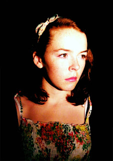
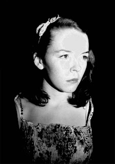
 This photography is set out differently to the rest of the ones I took. It is a mid shot of Kate where most of her body is seen in the photography and taken from straight on. With Kate still not looking directly at the camera give the viewer that confused feeling of what is she looking at, and the natural serious expression on her face suggest it's something shes not too sure of. Having an image of her from straight on gives the viewer a better idea of how old Kate might be and from them having a clearly image of her would allow them to have an instantly opinion on her and her role in the trailer.
 This photography is a close up mid slightly high angle shot of Kate. I wanted to take the image from a slight high angle as it shows how vulnerable and innocent Kate is, doing so gives away part of the trailer plot to the viewer. This makes the viewer more interested in the poster and the trailer. With Kate looking away from the light, it only highlights part of her face keeping the other half in the shade. This contrasts represents the dramatic change in the teaser trailer where it changes from being a happy normal day for Kate to her being changed and followed by someone or something.
 This photography is a mid close up shot of Kate at a slight right angle. This image is very similar to one of the previous photographs taken, just from the opposite angle. As Kate is facing towards the light the features on her face stand out a lot clearer and clearly show the serious expression on her face.
 This image is a mid shot of Kate looking to the left. Not having her face directly into the camera suggests to the viewer that she is looking at something or wary of something. This image it its self creates suspense as the viewer has no idea what Kate is looking at. The natural serious expression on Kate's face completes the idea of this image being for a horror or thriller film poster, if she was smiling and being happy it would fail the object completely of this being for a horror thriller film poster or magazine front cover.
 This second image is taken from a slightly high angle of Kate from a side angle of her. Having her facing towards the light this time doesn't show all of her features in clear details, this also makes her face stand out and the first thing the viewer will notice is her face. Just like the previous photography Kate isn't look directly into the camera, this makes the viewer think that she was noticed someone, and having her looking into the light directly suggests to them that someone has noticed her as well.
 The third is image is very similar to the second image, the only difference is I took the image on more of an angle and the contrast of light and dark isn't as obvious. This is because i moved the light out of the way so it wasn't directly shinning on her face. Doing so made her features clearly and having her on an angle looking away from the camera has the came effect on the viewer as the previous photographs.
 In this photo I tried to take the image from a high angle which shows venerability and having it as a mid close up shot makes it easier to structure a magazine front cover and film poster around her face. Her face expression seems very concentrated, and having her looking away from the camera suggests to the viewer that she is looking on something fat away. This makes the viewer image what she could be looking at and along with the conventions of a film poster or a magazine front cover would make them imagine what the film is about.
 This photography is set out differently to the rest of the ones I took. It is a mid shot of Kate where most of her body is seen in the photography and taken from straight on. With Kate still not looking directly at the camera give the viewer that confused feeling of what is she looking at, and the natural serious expression on her face suggest it's something shes not too sure of. Having an image of her from straight on gives the viewer a better idea of how old Kate might be and from them having a clearly image of her would allow them to have an instantly opinion on her and her role in the trailer.
 This photography is a close up mid slightly high angle shot of Kate. I wanted to take the image from a slight high angle as it shows how vulnerable and innocent Kate is, doing so gives away part of the trailer plot to the viewer. This makes the viewer more interested in the poster and the trailer. With Kate looking away from the light, it only highlights part of her face keeping the other half in the shade. This contrasts represents the dramatic change in the teaser trailer where it changes from being a happy normal day for Kate to her being changed and followed by someone or something.
 This photography is a mid close up shot of Kate at a slight right angle. This image is very similar to one of the previous photographs taken, just from the opposite angle. As Kate is facing towards the light the features on her face stand out a lot clearer and clearly show the serious expression on her face.
Friday 1 October 2010
Second Draft Film Magazine Front cover
 This is my second draft film poster. I kept everything the same from the previous front cover, the only thing I changed was add extra plugs and text to improve the cover. Again, looking at film magazine front cover on the Internet and the previous front covers I have analysed on my blog I came up with some new plugs. The plugs I create were 'Review of the year', '20 new films', 'Harry Potter on set exclusive', and' SAW picture special'. Using the layer style tool in Adobe Photoshop I edited each plug to make each one unique and stand out. This makes the front cover very appealing and interesting for a viewer to look at. using the brush tool in Adobe Photoshop I added a blood splat which contributes to the horror thriller theme to the whole film magazine front cover. Using the same layer style tool I also edited the blood splat to make it stand out more from the black background. I also changed the text beneath the film title so it actually had something to do with the film. The text has the films tag line, which is 'It lies beneath the trees', and below that has 'On set! Behind the scenes of the worlds most frightening film!'. I included this to entice viewers to go and see the film, also having 'Frightening film' as alliteration again emphasizes the horror and thriller theme.
A way how I could improve my second draft film magazine front cover would be by taking more photographs of Kate, manipulating them and including them in magazine front covers.
Second Draft Film Poster
 This is my second draft of a film poster. Comparing to my first draft film poster you can see the same image has been used but just edited more using Photoshop. I change the colour contrast of the whole image so it didn't look too cold and erry in contrast with the text used on the poster. I choose a warm colour as the background as it would contrasts with the text on the poster and make it easier for a viewer to read. I also think editing the image in this way have gave the image an old accent effect which questions the viewer about what era the trailer is set in. using the stamp tool in Adobe Photoshop I cover over ever other part of the image apart from Kate's face and top body part area. I then moved the image into the center of the page which gave the film poster more structure. I Included an actors and actress's' names in the top left and right corners which makes the film posters more realistic. I also moved the film title and tag line to the bottom part of the film posters. Having the rest of the conventions all grouped together and central in the poster gives the poster more structure and helps keep attention of the main image.
A way how I could improve on my next film poster draft would be to take more images, manipulate them and include them in a film poster.
Subscribe to:
Posts (Atom)